This is the third of a series of blog posts in which I have tried to journal my steps and processes in converting some older fixed-width sites to responsive layouts.
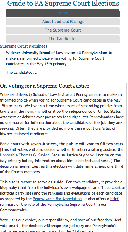
Responsive version of Guide to PA Elections:
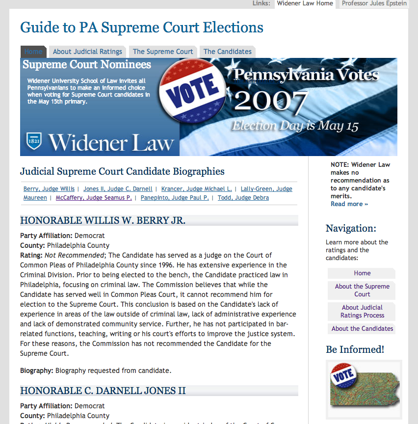
Older fixed width site of Guide to PA Elections:
If you are reading this and also newer to responsive layouts as I am, hopefully you can pick up some helpful tips. (You can read the previous posts in this series Get ‘RESPONSIVE’ In a Few Short CSS Codechanges: Give It A Try! and Learning how to be Responsible & Responsive is Fun! if you are looking for some ideas on how to get started with Responsive design)
The site I chose for this make over is a small 4-page site originally  designed at a fixed with of 760px.  Additionally, the main navigation was just  a series of linds in a paragraph. I removed that older main site navigation and in its place used an unordered list for accessibility.  I’ve left most of the older code in place in comments as a guide to what I changed and/or added. I will continue cleaning the code bit by bit, but the main elements are mostly finished.
One new challenge for me was how to maintain the aspect ratio (with and height) of some of the elements, in particular the large image at the top. I wanted it to scale proportionally and was finding it was distorting at different breakpoints.
Enter the padding-bottom value for that same element. In fixed-width layouts I can specify the width and height of elements, for example:
.box {
width: 100px;
height: 50px;
}
In responsive design, we specify percentages for width, but the same cannot be done for height, as in the example below the height will be ignored.
.box {
width: 100%;
height: 50%;
}
However, if you add a  the padding-bottom value for the .box element in this example, the padding is calculated relative to the element’s width.
Here is the trick
.box {
width: 100%;
height: 0;
padding-bottom: 50%;
}
My original image size was 760px x 200px. Using a ratio calculation 3,8 to 1 I came up with the height being about 26% of the width. I used this in my CSS to allow the image to size up and down proportionally.
#desc {
.
.
.
height: 0;/*notice the height is set to 0*/
padding:0 0 26% 0;
background:#505050 url(“../images/front.jpg”) top left no-repeat;
background-size: 100% 100%;
.
.
.
}
Additional notes: Â I have developed quite a penchant for the basic template from HTML5 Boilerplate. It sets you up with a basic shell, all the CSS resets and viewport code you need, and some Internet Explorer specific styles.
<!--[if lt IE 7]> <html class="no-js lt-ie9 lt-ie8 lt-ie7"> <![endif]-->
<!--[if IE 7]> <html class="no-js lt-ie9 lt-ie8"> <![endif]-->
<!--[if IE 8]> <html class="no-js lt-ie9"> <![endif]-->
<!--[if gt IE 8]><!--><!--<![endif]-->
<meta charset="utf-8" />
<meta http-equiv="X-UA-Compatible" content="IE=edge,chrome=1" />
<meta name="description" content="" />
<meta name="viewport" content="width=device-width" />
<!-- Place favicon.ico and apple-touch-icon.png in the root directory -->
<link href="css/normalize.css" rel="stylesheet" /> <link href="css/main.css" rel="stylesheet" />
<script type="text/javascript" src="js/vendor/modernizr-2.6.2.min.js"></script><!--[if lt IE 7]>
You are using an <strong>outdated</strong> browser. Please <a href="http://browsehappy.com/">upgrade your browser</a> or <a href="http://www.google.com/chromeframe/?redirect=true">activate Google Chrome Frame</a> to improve your experience.
<![endif]--> Â <!-- Add your site or application content here --> Hello world! This is HTML5 Boilerplate.<script type="text/javascript" src="//ajax.googleapis.com/ajax/libs/jquery/1.9.1/jquery.min.js"></script>
<script type="text/javascript">// <![CDATA[
window.jQuery || document.write('<script src="js/vendor/jquery-1.9.1.min.js"><\/script>')
// ]]></script>
<script type="text/javascript" src="js/plugins.js"></script><script type="text/javascript" src="js/main.js"></script>
<!-- Google Analytics: change UA-XXXXX-X to be your site's ID. -->
<script type="text/javascript">// <![CDATA[
var _gaq=[['_setAccount','UA-XXXXX-X'],['_trackPageview']]; (function(d,t){var g=d.createElement(t),s=d.getElementsByTagName(t)[0]; g.src='//www.google-analytics.com/ga.js'; s.parentNode.insertBefore(g,s)}(document,'script'));
// ]]></script>
I have still to finish converting some of the padding  widths from pixels to percentages, but as of today, this is beginning to look functional. Testing in IE will be the next step.