This is a followup to my previous post Learning how to be Responsible & Responsive is Fun!.
With this quick ‘Site Makeover’ I wanted to demonstrate that in a few worthwhile hours of your time, you can take  older, non-responsive sites and make them easily accessible to  modern viewports.
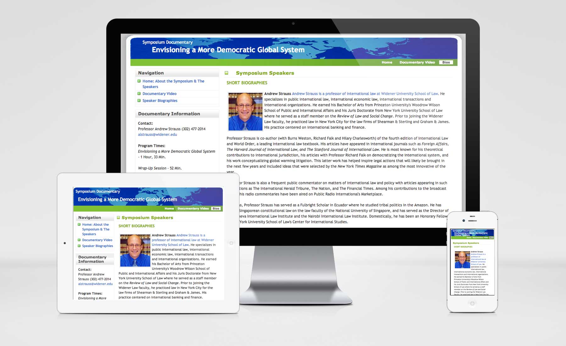
BEFORE and AFTER (Visit the deprecated Fixed-width site (The original 820px fixed-width site Envisioning a More Democratic Global System, fixed-width site is not very friendly when viewed from tablets or mobile devices.) and my “Makeover Edition’, the demo Responsive Version of the Site )

My approach: By adding a few media queries set at Breakpoints ‘under 320px’, ‘320px to 480px’, ‘480px to 768’ and ‘larger than 960  or widescreen‘, I was able to make  this site responsive. It required the re-organization of a few html blocks of content so that hiding and revealing  of certain elements at different viewport sizes would render content in the appropriate semantic order. I moved  the sidebar from it’s original spot at the top of the HTML order to the bottom. I did this so that the sidebar (<div id=”sidebar”>) — which is viewable at 320px or larger floated to the left — collapses and displays UNDER the main div (<div id=”main”>). Remember to always design for MOBILE first and in your media queries everything gets inherited from smaller (‘320px to 480px’) to larger ( larger than 960  or widescreen‘) .
You want to be sure you also target all your WIDTHS. convert all your widths into percentages. Be sure to use your CONTEXT width ( the container) to figure out your TARGET with (the value you are converting to percentage). Here is a quick review of Context and Target and a neat calculator to help you convert quickly.
Since THIS IS A WORK IN PROGRESS more remains to be tweaked (for example, IE browsers below version 8 do not support background image scaling, so I need to add an IE specific style to target the header, footer and body background images to allow them to scale), but you can see the progress as of now by collapsing and expanding your browser window. OH, and remember: you need to add  this little bit to your page, to ensure you can view it all on mobile devices.
<meta name="viewport" content="width=device-width" />
Also, I would suggest that you use the normalize.css  and the modernizr-2.6.2-respond-1.1.0.min.js and jquery-1.9.1.min.js that come bundled with Initilizr’s HTML5 Boilerplate. It gives you lots out of the box to make your life easier.
I used the elements at the top as seen here:
<!--[if lt IE 7]> <html class="no-js lt-ie9 lt-ie8 lt-ie7"> <![endif]-->
<!--[if IE 7]> <html class="no-js lt-ie9 lt-ie8"> <![endif]-->
<!--[if IE 8]> <html class="no-js lt-ie9"> <![endif]-->
<!--[if gt IE 8]><!--><!--<![endif]-->
<meta charset="utf-8" />
<meta http-equiv="X-UA-Compatible" content="IE=edge,chrome=1" />
Envisioning a More Democratic Global System: MAIN
<meta name="description" content="Envisioning a More Democratic Global System" />
<meta name="viewport" content="width=device-width" />
<link href="css/normalize.min.css" rel="stylesheet" /> <link href="css/envisioning.css" rel="stylesheet" />
<!--[if lt IE 7]>
<p class="chromeframe">You are using an <strong>outdated</strong> browser. Please <a href="http://browsehappy.com/">upgrade your browser</a> or <a href="http://www.google.com/chromeframe/?redirect=true">activate Google Chrome Frame</a> to improve your experience.
<![endif]-->
For IE browsers I will need to fiddle with this code:
/********************************************
LAYOUT
********************************************/
div#wrap {
width: 100%;
height: 100%;
-ms-filter:”progid:DXImageTransform.Microsoft.AlphaImageLoader(src=’http:www.cassandraking.net/demos/responsive/envisioning/images/content.jpg’, sizingMethod=’scale’)”;
filter:progid:DXImageTransform.Microsoft.AlphaImageLoader(src=’http:www.cassandraking.net/demos/responsive/envisioning/images/content.jpg’, sizingMethod=’scale’);
}