
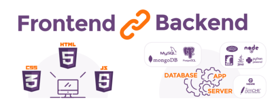
With the rise of both very large mega desktop screens and smaller portable devices, we as developers have a RESPONSIBILITY to serve up sites that display properly no matter what the device or context. With that in mind, I recently started diving into responsive web design. (Visit my Responsive VetClinic Demo site here) Â Initially I was OVERWHELMED by the long, long, long list of resources, sites, frameworks and tips for beginners. Here are the few resources that, as a newcomer, you will want to have in your web developer’s toolkit:
RESOURCE ONE:
Buy this book! RESPONSIVE WEB DESIGN, by Ethan Marcotte. Indispensable, fun to read! I read through it over  few nights. The great feature of this book is that you can simply read it, without having to sit in front of a browser or code editor. If you are familiar with the basics of HTML and CSS, you can read this in any spare moment: train, lunch, break, etc.
RESOURCE TWO:
Be sure to sit down and either create a responsive mini site or page from scratch or convert and existing fixed-width site  to a responsive layout. The benefit of this first step is wrapping your head around the concept of  Progressive Enhancement: design to be sure you an offer the content of the site for the smallest device screen first and scale up to accomodate progressively larger screens and devices. You also want to really nail down the concept of Breakpoints and Media Queries.
RESOURCE THREE:
Once you have practiced creating a simple layout from the ground up, and you have the concept of designing for mobile and scaling up as well as media queries, you can definitely simply your life with some pre-made templates. Â You can begin with either of these three frameworks depending on what you prefer: HTML5 Initializr allows you to begin an HTML5 responsive project in a matter of minutes. The Goldilocks Approach is another great starting point with some premade CSS and HTML files, and finally, you can use Skeleton, it comes with both the PSDS and the HTML/CSS to begin creating your site.