 I love gum: a Haiku
I LOVE gum all day,
Bad habit I can’t escape,
Model I’ll never be.
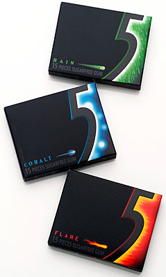
I just bought three packets of beautifully designed gum. Admittedly, this was an impulse buy. I just had to get my hands on that beautifully-designed packaging. Opening the box is a delight, flip the lid and you are greeted by bright green, red or blue foil stamped wrappers. Unwrapping each piece of gum is like unwrapping a gift. Delicious gum and beautiful design come together with “5” , the new chewing gum from Wrigley’s.
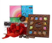 Other beautiful typographic solutions surround me at both Target and Ikea stores. Take, for example, a box of Target’s Choxie chocolate. I’ve fallen victim (yes, plural, as in more than ONE time) to the beautiful typography and crisp box design. However disappointing it was to find that the candy inside itself was sub-par, I did not want to throw away the box or it’s contents. What is it about these particular visual cues that make me want to ‘keep’ and not ‘toss’?
I’m a sucker for it all and I’m at peace with myself over it.